N is the line you have. The +1 is its golden twin.
Points are the golden twin, the line in code. Solid is the line you build. Click to replay.
In engineering, N+1 is the next revision. In our logo, the white N is the line as it runs today. The gold +1 is its golden twin: the next revision, proven in physics before it is built. Drawn as points, it is the twin in code; solid, it is ready to build. Only the +1 is ever gold.
Files





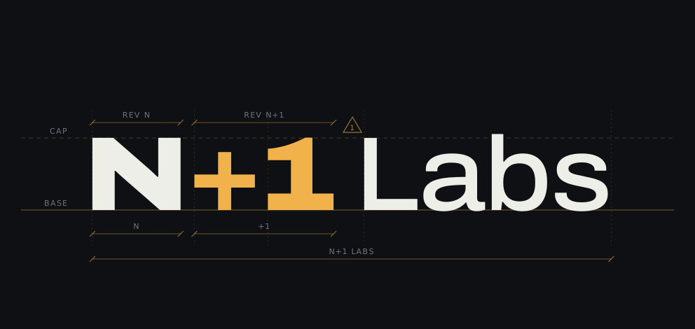
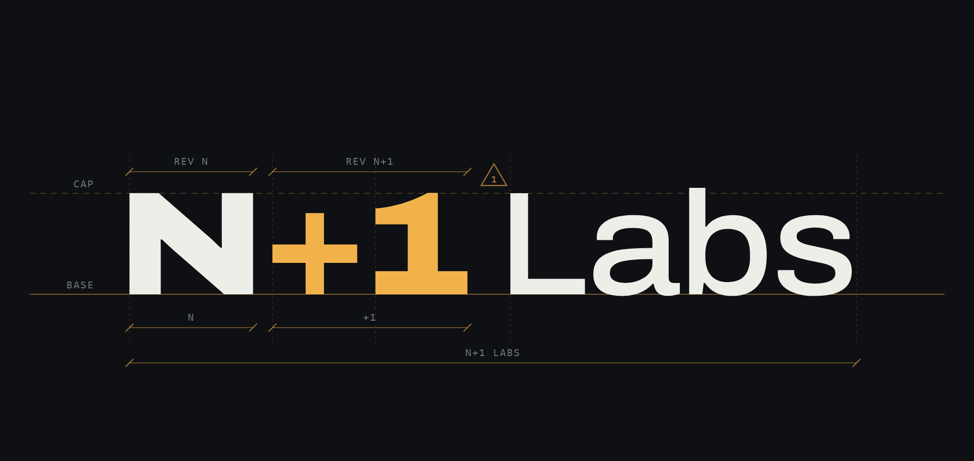
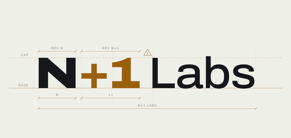
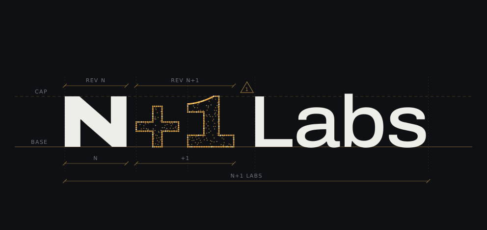
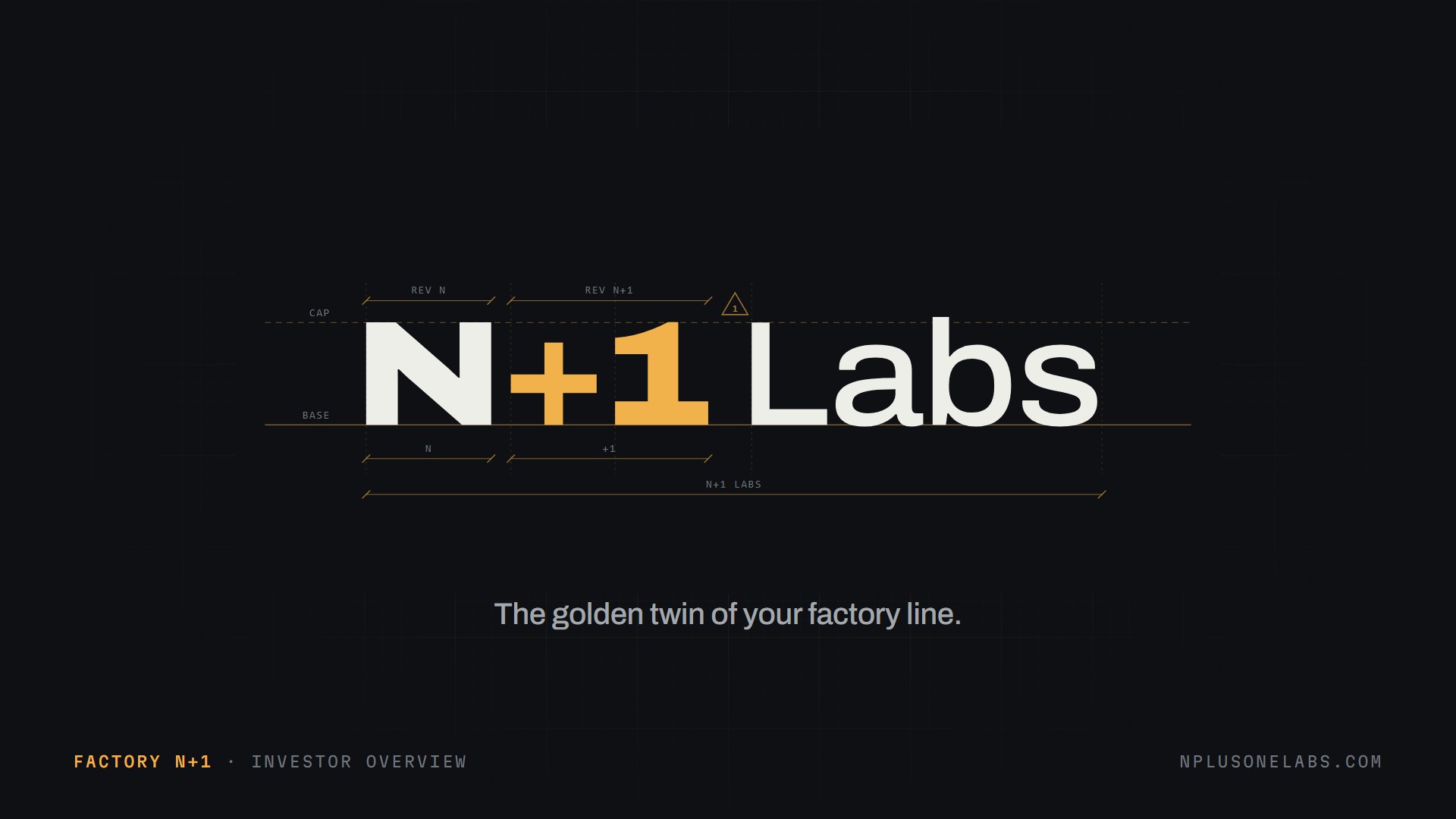
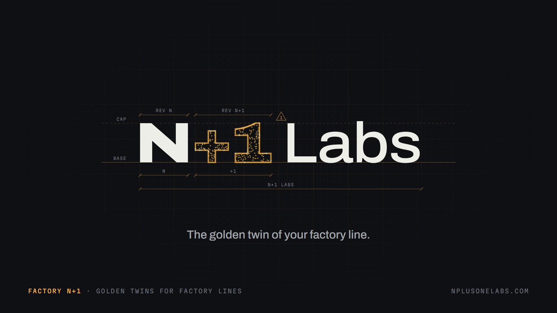
One job each.
White is the real line. Gold is the golden twin and the +1. Red only ever means a failure. A twin’s stage has its own colour: blueprint for draft, silver for calibrated, gold for golden. Only a golden twin glows.
- Graphite
#0E1013Background - Ink
#EDEEE8Text, the real line - Sodium gold
#F2B24BThe +1, the twin - Gold spark
#FFE4AABrightest twin points - Gold mid
#C47F22Secondary twin lines - Gold ink
#8E560BGold on light backgrounds - Draft blueprint
#6FA0E0Stage 1: draft twin, from your design - Calibrated silver
#D3D8DEStage 2: corrected by real builds - Failure red
#E5352BFailures only - Vellum
#EFEFE9Light drawing sheets
Archivo and Martian Mono
Archivo ExtraBold, 125% wide
The logo’s N+1 and headlines (headlines at 108 to 112% width)
Archivo Regular for text
Body copy and captions
MARTIAN MONO · LABELS AND READOUTS
Kickers, data, dimensions
Rules
- Write it “N+1 Labs” or “Factory N+1”, never a bare “N+1”. The domain is nplusonelabs.com.
- Only the +1 is gold. N and Labs stay white on dark, graphite on light.
- The +1 sits on the baseline at full size. It is never a superscript.
- Points are for large formats. The +1 as points (the golden twin) appears on deck covers, end cards and launch posts, or as the reveal animation. Anywhere the logo must be read small, the +1 is solid.
- Keep gold matte. Flat in the interface; glow only where it stands for light, in the point-cloud twin.
- Clear space around the logo is at least the height of the N.
- Don’t recolour, outline, add effects, stretch, or set the logo in another typeface.